How To Create a Print-Ready Brochure Design in Photoshop
It is easy to design brochures using Adobe Photoshop but designing a great layout that is already print ready requires some specific additional setups. In this tutorial, we will go through the process of setting up and designing a brochure that’s ready for printing. Let us get started.
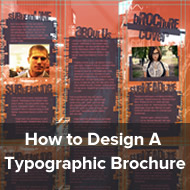
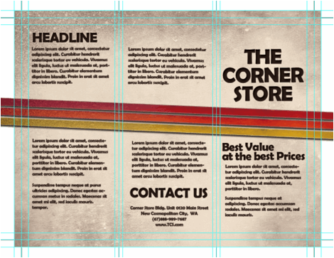
Final result
Step 1
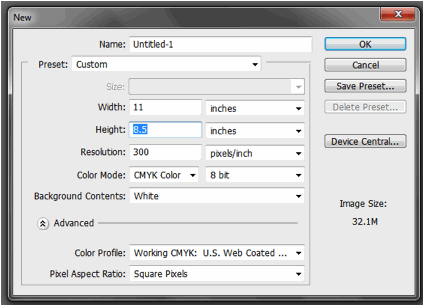
The important thing you must remember when setting up a “print ready” design is that you must setup the document properly early on. You will face a lot of issues with your document if you only adjust your design for printing at the last part of the process. This means that once you create a new document in Photoshop, know that you should already be specific with your settings. For a typical “letter-sized” TRIFOLD brochure, the basic settings that you should try out are listed below. Just modify the dimensions here as you see fit.
- Dimensions (WxH): 11×8.5 inches (a landscape oriented letter sized document)
- Resolution: 300ppi (minimum recommended for printing)
- Color Mode: CMYK (for four color printers)
Step 2
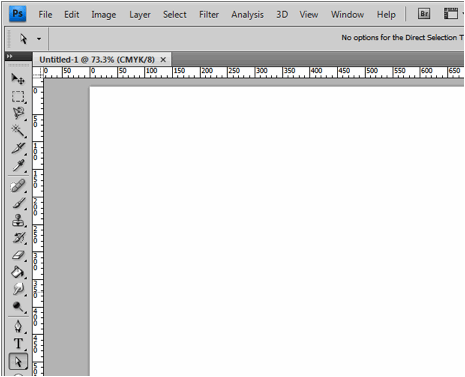
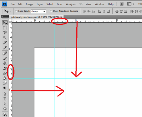
Once we have setup the main document, we are now going to add the guidelines. Guidelines are important in making your design print ready as it will help you place your design elements correctly within the bounds for printing. To start creating guidelines you must first have the rulers visible in your Photoshop. If you do not see rulers in your document, press CTRL+R or go to View -> Rulers. You should see the rulers appear at the edges of your document.
Step 3
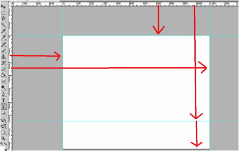
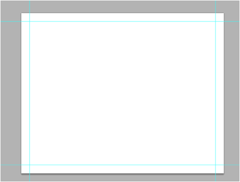
Great! Now we are going to define the edges of our document by using the guidelines. Simply click and drag your mouse from the horizontal or vertical ruler to the document. Place the light blue guideline at the precise edge of the canvass. (do not worry about it being at the edge, you will see them clearly enough layer once we increase the size of our document. For now, make sure they are in the correct place.
Step 4
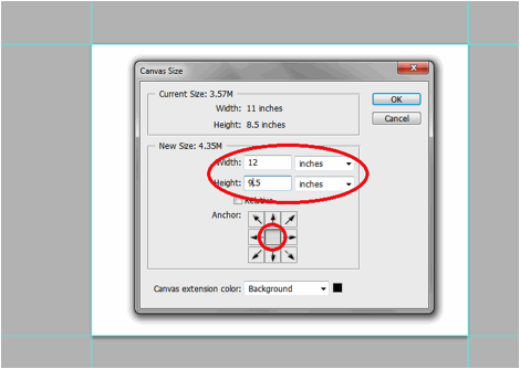
Now, we shall make our canvass size bigger. Go to Image -> Canvass Size. Add 1 inch to the width and height values. Also make sure that the anchor is set to the center. By doing this we basically create a margin for our document.
Step 5
It should now have some borders like the picture below. Take note that if your background color is not white, and is set to a different color, the new spaces will probably reflect that color. So just fill those areas with white with the paint bucket tool.
Step 6
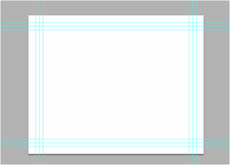
Now, we setup the bleeds. Zoom in a bit on a corner of the canvass (hold the ALT key and use the middle scroll mouse button to zoom in easily). Now, create an additional guideline that is 0.25 inches away from our initial margin. This will be the bleed. This margin is the leeway that a designer gives for discrepancies in printing. Do this for all four sides of our document.
Step 7
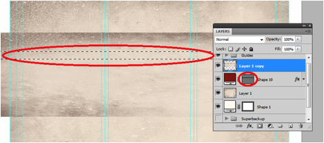
Also, in the same fashion, create a security guideline set. These are the guidelines where no text or graphic must cross. This is our main design border so to speak so that no elements get too close to the edges of our design. Just set these guidelines at 0.25 inches away from our bleed border. In the end, you should have something like this:
Step 8
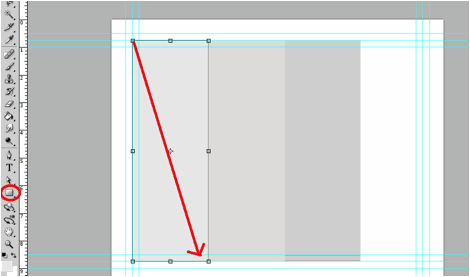
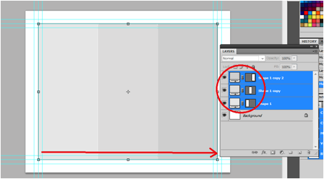
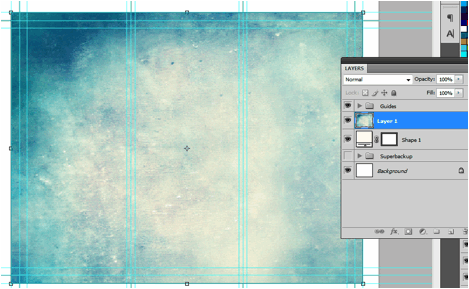
Great! Now, before starting with the design. Take note that a Trifold brochure has three major parts or panels. We will create the column guides so that it is easier for you to see where the folds of the trifold brochure will be. To do this easily, create a rectangle shape with a grey color using the Rectangular shape tool. (Do not worry, it can be any size.) Make sure of course that you start from the shape from the corner of our bleed of course to span the whole height of that area. Then, duplicate this shape two times (press CTRL+J). Position the duplicates at the side of the original rectangle. In this example, we have changed the color of the shapes so that they are easily visible.
Step 9
Now, to make the columns equally distributed across the document, we select all three rectangles in the layer panel. Just hold down the shift key and click on all three layers. Afterward, press CTRL+T to enable the transformation of the shapes. Drag the transformation box to the right side bleed border.
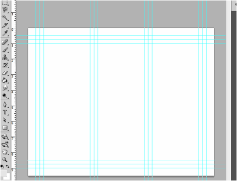
Step 10
With those panels in place, you should see where you should put your panel or column guidelines easily. Just add those guidelines like you did with the others. ALSO, add a security border on the left and right side of them as needed. Delete the rectangles once done. In the end we should have a FINAL looking guide document like the picture below. Now would be a good time to save our document as a brochure template.
Step 11
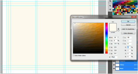
Now, before we go forward with our design, we will just setup a base background and some trim guides. Using the rectangle shape tool, we have created a new rectangle with a theme color. Here we are using an off white color (#fffaf1). Make sure it spans our guidelines including the bleed area. This should mark the whole span of the document.
Step 12
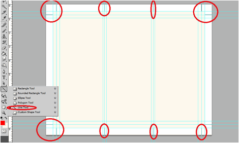
Next, using a simple line tool we place in a 1pixel line as trim guides. Use the guide lines for the bleeds to add the trim lines at the outer edge of our design like so. Create a new group and place all these line layers within that group to make things more organized.
Step 13
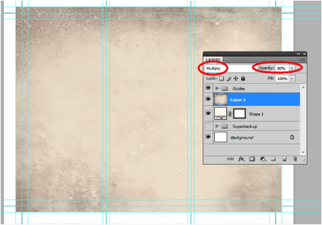
Great! Now make a final save for this template. You should now be ready to create the real design. Create a new save file (after creating your file template) and name is as your new brochure. Then paste in the background texture or color that you want for your design. Here we are using a grunge texture to establish the theme that we want. We got this for free through this generous person on deviant art. (http://cloaks.deviantart.com/art/Grunge-II-Texture-Pack-91811854).
Step 14
Then, press CTRL+SHIFT+U to desaturate our texture layer. Change the blend mode of this texture layer to “Multiply”. This is done through the layers panel. Reduce also its opacity to around 80%.
Step 15
Now we shall add additional elements to our design. First we create some ribbons. Using the rectangle shape tool we inscribe a red stripe across our design.
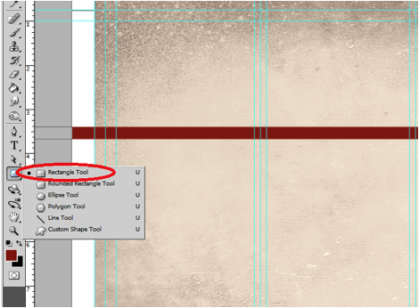
Step 16
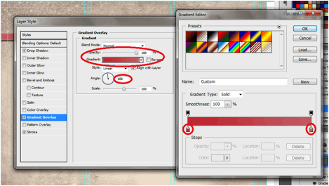
Then, double click on the stripe layer. The layer styles and blending options window should open. We will now add some extra effects on our stripe to make it look better. First up is a Gradient Overlay. We click on the Gradient Overlay checkbox and change the color gradient fill by clicking on its box. Make sure to use a good blending of two colors that matches your theme of course in the gradient editor. Also, change the angle of this layer style to 100 degrees.
Step 17
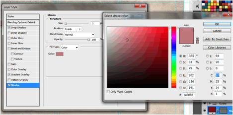
Then, click on “Stroke”. Change the following attributes.
- Size: 3px
- Position: Inside
- Color: (use a lighter shade of your gradient).
Step 18
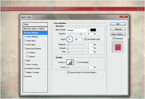
Finally, add a drop shadow. Just click on the drop shadow checkbox then change the following values:
- Drop Shadow color: Black
- Distance:3px
- Size: 5px
- NOTE: you can adjust the values depending on how big or small your stripe is.
Step 19
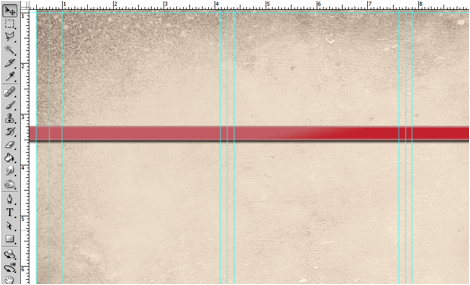
Once done, you should get something like the picture below. Now, in terms of color this is great, but it is too clean. This means that we will want to add texture.
Step 20
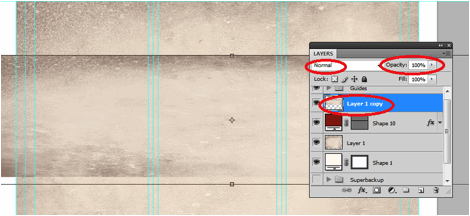
To add a texture, we will just use our background texture image. To do this, first duplicate our texture layer by clicking on it in the layers panel and pressing CTRL+J. Then, we move it to the front of our red stripe layer. Change the blend layer back to normal and up the opacity back to 100%. Afterwards, we reduce its size a bit by pressing CTRL+T and then shifting the size to match with the stripe.
Step 21
Now, we will delete the areas of the texture. To do this, hold down the CTRL key and click on the thumbnail of image mask of our stripe (NOT THE TEXTURE). Then press CTRL+SHIFT+I to select the inverse of the stripe layer.
Step 22
Then, click on the texture layer, and then start erasing its edges, leaving only the texture within the stripe area.
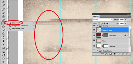
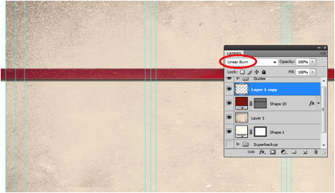
Step 23
Finally, change the blend mode of our stripe text layer to “Linear Burn”. This gives us that great texture effect to our stripe. For now, we have removed the guidelines for you to view the textures much clearer. Remember that you can turn on or off the visibility of the guidelines by pressing CTRL+H.
Step 24
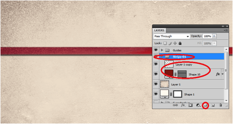
Once you are happy with your stripe, create a layer group with this modified texture and the main red stripe. You can do this easily by clicking on the “create a new group” icon in the layers panel.
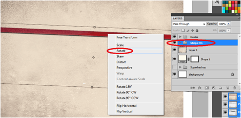
Step 25
Now, with the group selected, we rotate the stripe so that it is at an angle in a creative fashion. To do this, press CTRL+T to transform our stripe group. Move your mouse over the edge of the box and then just drag your mouse to start rotating the stripe.
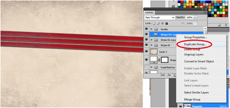
Step 26
Now, right click on the Group layer and select the option “Duplicate Group”. Do this at least two times to create a total of 3 stripes in our design. Transform and rotate these stripes as you see fit for your design.
Step 27
Here is a nice trick. If you want to change the colors of the ribbon, all you have to do is to go into one of the ribbon groups, double click on the actual stripe layer to access its layer styles and then just change the gradient overlay settings with your choice of colors.
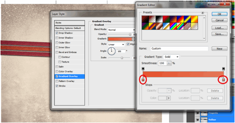
Step 28
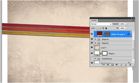
For our example we changed the gradient overlay colors for the second and third duplicate stripes to get a nice multi-colored effect for them. Of course, just match the change of colors depending on your color theme.
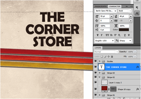
Step 29
Now, we add the title. Using the text tool we write in our title in a theme color, here we will be using a very dark brown. Just use the font style that fits your theme of course. Also, position the text just above the ribbons or stripes. Take note that the title must be on the right most panel as that is the cover area of brochures in printing. Also remember that you can use the character panel to adjust the line spacing, character spacing and a myriad of other text features and attributes. This should help you edit your title as you see fit correctly.
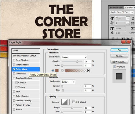
Step 30
Then we go to the layer options for the text. Double click on our text to access those options. First, click on the outer glow option. Change the color of the outer glow to a slightly lighter version of the dark brown color that we used.
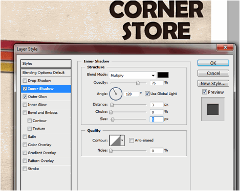
Step 31
Then, click on Inner Shadow. Use a black shadow, with a 3 distance and a 5 pixel size.
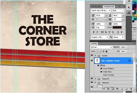
Step 32
Once we apply the layer styles, it should look something like the image below. Take note of the guidelines again. Make sure that your text title is well within the security lines that we placed. Toggle the lines on and off by pressing CTRL+H.
Step 33
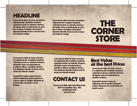
Great! Now, just type in the rest of your content. Orient them appropriately on the three panels. Again note that the right most panel is the cover, the middle panel is actually the BACK cover and the left most panel is the inner flap. DO NOT FORGET to always put in the main text paragraphs within the guidelines. We also used the same layer styles in the title for the headlines and sub-headlines.
Step 34
Once we hide the guidelines you should see something like this:
Great! Now you have the FIRST SIDE of our brochure. In the next installment of the tutorial we will work on the other side. However, by now, you should know most of the tricks for creating a basic brochure design.